Landscape Photography while sheltering at home - Radical depths of field
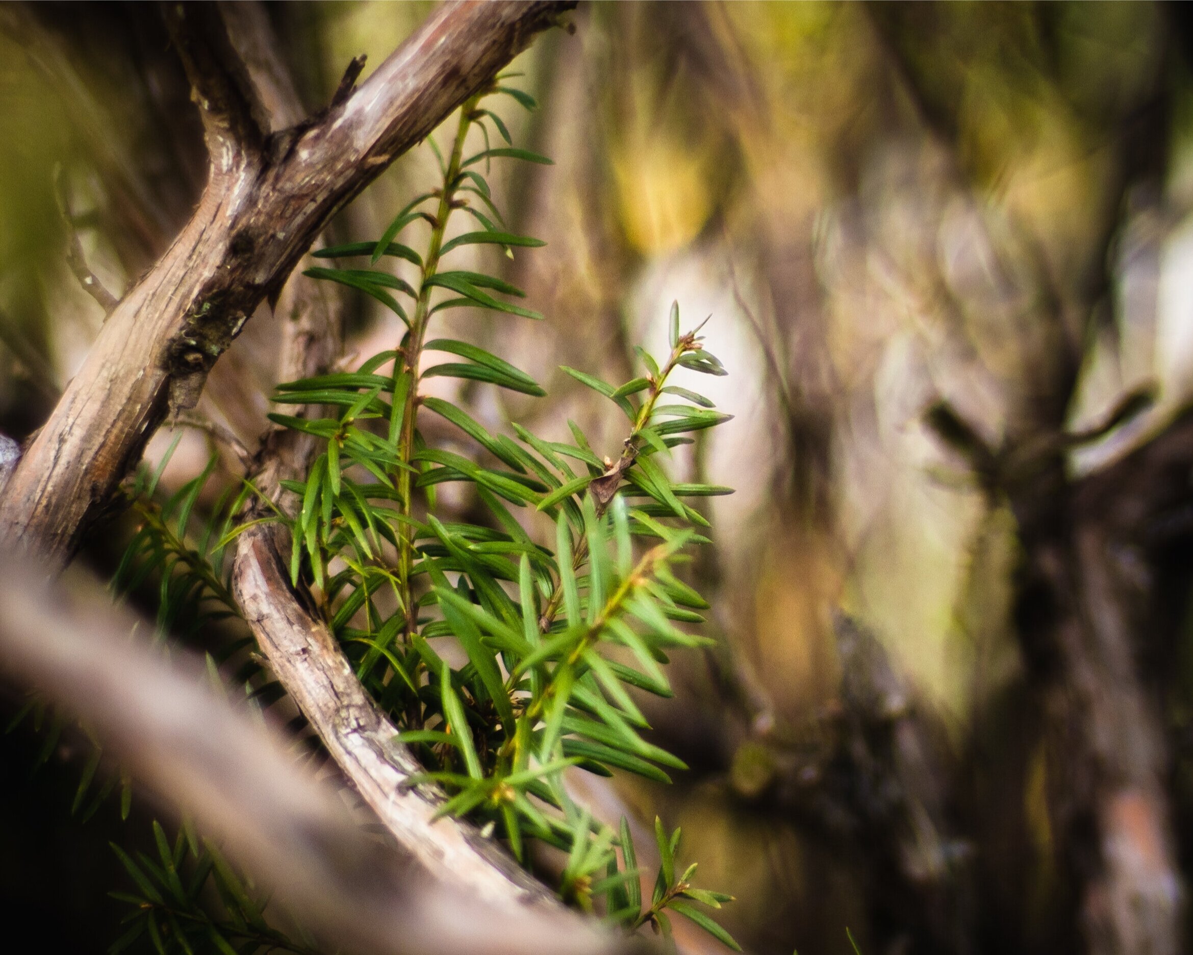
A fine shot of some greenery which is accentuated by contrast to an out-of-focus and indistinct background. Nothing however in that background serves much purpose in the photo other than to not distract the viewer’s attention. The repeating patterns of branches in turn resulting in more but smaller branches is a somewhat trivial example of fractals.
There is a concept in Mathematics called fractals. In physical terms, a fractal refers to the existence of similar patterns that can appear or become apparent at different scales. For instance a shoreline as seen from a mile above may have patterns of bays and promontories, with irregular lines and features. Up much closer, when looking down at a very small section of rocky shore from just eye level, again indentations and small promontories can be found, also with a new set of irregular lines and new but oddly similar features. What is seen on a large scale can share patterns and characteristics with the small scale.
While thinking about this, it occurred to me that my enjoyment of landscape photography might be employed on a much, much smaller scale. This thought coincided with the reality of our current lives in coronavirus lock-down. I cant go anywhere anyway. So what can I make of my immediate region. And by “region” I mean my yard and just a bit down the block.
I always welcome each year when the forsythia bloom as it tells me to put down seedlings inside for this year’s tomato plants. And of course, in these parts, they are the first real splash of a large amount of color. As I will discuss below, this shot was taken with a fast lens, wide open which gave a very narrow depth of field. Here that meant that I could isolate one little bunch of flowers from the mass of flowers on my bush.
But first, there is a lot that should be said during times as we have right now. As I write this I am sitting in an area with amongst the fastest growing infection rates and mortality rates attributable to the coronavirus pandemic. In a breathtakingly short period of time, everything has changed. But by the time some of you read this, all of that could have changed once more, for us here and perhaps there. And I hope for the better for us all. So many people are suffering from direct and indirect impacts, so many people are losing so much. On the one hand, I do not wish to in any way trivialize the real suffering, the exhausting and risk-filled work and the hardships of others by not addressing it at all. Or by writing on an unrelated topic.
On the other, I think it is worthwhile to explore artistic enjoyment and try and find beauty and new aesthetic insights where we can, in harsh times or otherwise. And I do have a lot of time on my hands these days, locked away here with my son. So with that in mind, I am going to delve into my fractal inspired search for landscapes in the smallest, nearest places I can access.
Though I like this shot, and there is some dimensionality to it as branches get more and more out of focus, there are still a lot of dead areas where the out-of-focus regions are simply rendered into neutral non-distracting space. Sometimes that is what you need; but sometimes you hope for more. Below there is a shot of this same shrub but with a foreground subject much simpler and a background that adds substantially to the photo. Comparing these two shots essentially summarizes my whole point of this Dispatch.
A brief note on the photographs shown here and their location in this Dispatch. Paradoxically, given the fact that I have gone practically nowhere to shoot these, there are a lot more words in this Dispatch than most of my prior travel oriented submissions. And there are still a lot of photographs. I cover a lot of metaphorical, if not actual, ground here.
If I were to place the photos in the exact locations where the text demands, there would be a ton of words up front followed by a higher density of photos at the back. I have elected to spread them out instead, even if this means that the narrative hasn’t quite caught up to the subject where a photo illustrates that point. So there are a number of photos placed at the beginning that really don’t relate to the text at that very spot.
Take this one for instance.
There are some landscape compositional principles playing out here in what otherwise might be seen as just a photo of a few leaves. The in-focus areas on the bottom right grab the eye but then the viewer is drawn along a circular path to other features which leads to an examination of the whole. The background out-of-focus areas here are not particularly interesting but their being out of focus removes them from being too distracting. The spiral structure is another fractal reference, with the repeating patterns within mollusk shells being a prime example.
Still, I have put them in an order that is consistent with my overall point here. Towards the beginning, the photos will aim more at highlighting a given subject, with an interesting background but not quite a background which itself become a vital part of the photographic story. These initial backgrounds and foregrounds may help frame the subject, but they mainly just do that. These initial photos represent earlier efforts where I simply saw a subject and took a picture. I have also added captions to each photo that will tend to make a bit more sense once you read this whole piece but will start to give the reader an idea of what I am going for.
As the text goes on, the photos show out-of-focus peripheral areas that start to become far more important to the structure of the photo. This grows to the point where eventually the in-focus subjects just represent a starting or ending point, but the real enjoyment is in the areas that are out of focus. The background noise itself becomes the real story. This is, I think, where landscape photography becomes fully realized in a space of just a few inches in my yard.
I will explain all of that in what follows, but you can start to look at these with that ordering in mind. After you are done reading the whole Dispatch, you might go back and look at these photos in order again (reading the captions) to cement this visual progression. Or do this right now and then come back to keep reading.
Also, a big shout-out to Jefferson, my son and shelter-in-place co-resident, who is far more skilled at post editing and who gave me many helpful hints that greatly improved these photos before they got to this screen.
Here we start to see for the first time how a background out-of-focus area can be an element that improves the photo in its own right. The foliage in the background offers a complementary view of the foreground, while not being distracting. The effect is exaggerated by the extreme contrast in light. Notice repeating and branching (more fractals) use of triangles (along with circles and framed by a square), very strong geometric shapes to ground the photo.
So, on to the narrative.
Some of you will know that there is a branch of photography known as Macro, where up very close photos of things like bugs and tiny plants or water droplets are taken with specialized lenses at a range of just an inch or two. Wild and sometimes even grotesque features become visible, with the subjects being seen in a manner that is wholly inaccessible any other way. You will never consider the lowly insect the same way once you see it in a Macro shot.
This is not what I am going for here. I think Macro photographs are very interesting. And I am in no way saying that Macro is easy or of any less value. But I don’t have the equipment for it and frankly I am more interested in the sorts of features that make up a good landscape photograph. Macro photography is more about a subject (or maybe two subjects interacting, like one insect eating another). Bizarre as they usually are, seen as you’ve never seen them before (and difficult to capture well), the focus is still firmly on the subject(s).
Landscape is more about an overall composition with foreground and distance being separate elements while still working together, playing off each other with leading lines to take the viewer around the photo as the story of the shot unfolds. They contain geometric and complementary structure and repetition, with natural light creating mood and dimensions that vary by the season, the time of day and maybe even within seconds. While a good landscape photo also will have a main subject, in what that subject is embedded and framed will be as important, if not more so.
But mainly, I just wanted to see if landscape photography had a fractal nature that would suit our current inability to go anywhere.
At this point, I think the background is at least as important to the photo as the foreground. And it complements the foreground subjects in having similar geometric shapes and patterns. Without that fuzzy background, the multiple subjects in the foreground would not be of enough interest alone to photograph. If you are having any difficulty in seeing this photo in its entirety on the screen, just click on it and a full version will pop out. That is true for all the photos here.
So what then am I talking about, if not Macro?
Well, let’s start with the lens. Fortuitously, I recently made a bit of a plunge and got a really, really fast prime lens. For the non photographers, let me explain that. A fast lens is one that can be opened up very wide, with an aperture (the opening that allows light into the camera itself) much larger than normal. (“Prime” means it has a fixed focal length, not a zoom; mine is 55mm which falls squarely into the midrange.) This enhanced aperture size allows for much faster shutter speeds.
Because so much light is coming in already, the shutter needs to be open for much less time to get the same exposure. If you are shooting sports for instance this is important since the really high shutter speeds can freeze action. When you see a shot of your favorite football receiver making an incredible catch in the air, backwards and one handed, this was shot at a shutter speed so fast that 100 or more frames might be possible between the time he/she leaps up and then comes crashing down, hopefully ball in hand. And each will be razor sharp, not blurred by the movement. The sports photojournalist afterwards can then select the one photo in all of that which shows the catch in its most dramatic way.
This ability to increase shutter speeds is why they are referred to as fast lenses. A wide open aperture also greatly enhances shooting in low light situations where there can be limits as to just how slow the shutter speed can go and still get the crisp shot you want.
But what that fast lens does for me, and for many photographers, is that it also can change the look of the photograph. And pretty dramatically. As the aperture gets wider, the optics demand that the lens will allow for a smaller depth of field. And inversely, the smaller the aperture, the greater the depth of field. Depth of field refers to a range some distance away from the camera in which objects stay in focus, with anything in front or behind that area being out of focus. A narrow depth of field means that range is small.
As with the photo before, a generic shot of a magnolia blossom would be nice but somewhat “been there, done that”. But this background is starting to show how this old obsolete lens can turn imperfection into art. I am pretty sure I could not personally make brushstrokes of paint that would be as nice as the effect here. And they fully complement the shapes and colors in the blossom.
If you want the foreground and background to both be in focus, one way to accomplish that is to “stop the lens down”, which means reduce the aperture. This greatly increases the area which will be in focus. Really small apertures can even render a shot fully in focus from say 6 feet out to infinity. My very first camera way back in the early 60s had a tiny and fixed aperture (all plastic) which allowed that camera to not even need any focus control. Virtually everything would always be in focus due to the tiny aperture.
My new (used actually) lens permits an aperture as wide as f1.2 (I won’t get into this in much detail but a lower f-stop number inversely means a larger aperture; sorry, it is a nomenclature designed to confuse beginners I think). That f1.2 aperture lets in close to 6 times as much light as my normal travel zoom lens (Olympus 12-40mm 1:2.8 PRO) at an aperture of f2.8. (It’s a logarithmic scale, with the amount of light decreasing by half with each f-stop. The f-stops are 1, 1.4, 2, 2.8, 4, 5.6 and so on. These figures are the square roots of 1, 2, 4, 8, 16, 32 etc which represents the relative amount of light getting in - unfortunately if you are still trying to follow this, - in inverse. Don’t worry, you don’t need to know all these figures and math.)
This f1.2 also lets in a nearly twice as much light as my other fast prime lenses. These others in my camera bag can be opened up to a respectable f1.8 which does narrow the depth of field a good deal. It might seem like the difference between 1.8 and 1.2 can’t mean that much, but it really does. The relation is logarithmic, not additive.
Fortunately you really don’t need any of this information. It is enough to know that a faster lens opens a lot wider and so this optically narrows the depth of field; and f1.2 is considered pretty darn fast.
One little twig nearly in bloom, and somewhat softly rendered isn’t much alone. The wind was blowing this twig about and so I couldn’t get it in perfect focus. But that is okay because I think this is the first of this series where the background out-of-focus areas are more interesting than the subject. I love the implied geometry of the lines, almost like shattered glass plate. And yet fully organic. The colors and hints of other blooming twigs paint an image far greater than just the subject alone. Contrast this shot with the second photo above which is of the same shrub. Similar buds, but the backgrounds are wholly different. This one works so much better.
To give you an example, my 55mm f1.2 lens will give my camera a depth of field just shy of one little inch when shooting objects only about a foot and a half away. When I plug these figures into my computer App to compute the depth of field at these close distances from the camera, depth of field is simply eliminated altogether by rounding. It is that small. Apparently, the App thinks nothing will be in focus at this range with this lens.
So tiny adjustments to the focus ring can wholly change the area in focus and even change what is visible. And the objects out of focus are not just out of focus. They are converted into a phantasmal, swirling, bubbling mess. But oh what a mess, as we will see.
That mess, its geometry, attributes and character, is what makes or breaks a lens in this category. To a large extent, photographers in narrow depth of field situations are looking for how a lens deals with the out-of-focus “mess” almost as much, if not more so, than those objects which are in focus and ostensibly are the actual subject. Not all out-of-focus is equal. Far, far from it.
The jumble of in-focus subject is perfectly mirrored by the structure of cascading branches that fall away from view. I almost took this shot entirely out-of-focus, but I decided I still needed the in-focus objects to ground the shot in some sense of organic reality. But imagine the abstract shot that just the background would have made.
Now a f1.2 lens can be a big investment. Especially to buy one that is technically superior, giving good and vibrant color, with tack sharp images and having been expressly designed for today’s digital camera sensors. In fact I don’t have and won’t have a budget for those. They can easily run over a thousand dollars. Sometimes a lot more. But there are some good alternative options.
I have a mirrorless camera. Olympus OM-D E1-MII. I won’t go into all the immense and well fought arguments over these mirrorless (and crop-sensor) cameras compared to the mainstays of serious photography for a long time, the DSLR. (One critique is that my crop sensor camera cant possibly photograph narrow depth of fields, I think I have disproven that here.) Both mirrorless and DLSR permit interchangeable lenses. But amongst all the various pros and cons, the mirrorless camera has a sizable advantage in that thousands of old lenses from years gone by, that have had no use anymore in the DLSR world, no matter who manufactured them for whatever camera body, sitting forlorn and unused in closets and on dusty shelves, can now be stuck onto an adapter and tried out on a mirrorless. And for cheap.
So I found an old Zuiko 55mm f1.2 in excellent condition, built back around the early 1970s for use on the old Olympus OM1 cameras. (One of which had been the first SLR film camera I owned, bought for me by my Dad back around 1974 I think. My favorite camera ever, but film just isn’t where it is at anymore.)
With an adapter, my used, obsolete and almost 50 year old Zuiko 55mm, while built for film cameras, still would work on my digital mirrorless just fine. To be fair, because it was not built or optimized for digital sensors, it suffers a bit. It also wasn’t built for the crop sensor I have in my camera now. This means it isn’t perfect.
For one thing it won’t talk to my camera; so it is entirely manual. Entirely; there is no electronic communication between my camera and this lens. I have to set aperture and focus the old fashioned way, with the dials and rings on the lens itself. And my camera has no idea what it is set to. (That might be a problem for a lot of photography but not nearly as much for landscape where you carefully set your shots and take your sweet time.) It also isn’t as crisp or sharp when set wide open as a more modern lens built now, some 50 years later. When built, some of the features which we now take for granted in camera lenses, were then only a decade or two old. Technology has improved much since then.
A number of other attributes are not ideal compared to a modern lens of similar standards. It just wasn’t meant for focussing an image onto digital screens, especially a crop sensor. It was optimized for film at a 35mm size (my crop sensor is roughly half that size). This means that a fair amount of light entering the lens is wasted. But, it doesn’t cost anywhere near what those modern digital lenses do.
This photograph is an excellent example of a subject that is not terribly interesting all by itself. What makes this shot is how the subject is reflected in different layers of background. How geometric shapes and patterns are repeated and so emphasized. And how the background becomes something entirely new. The whole therefore becomes far greater than just the main subject.
And frankly, I wasn’t looking for “perfect” anyway. I have other very good lenses that can get close to perfect. Here I was looking for the wild, for the ability to render areas out of focus that were anything but perfect. I was hoping that the blurred areas would be something different than just an area of the photo which just happens to be, well, blurry. I was looking for enough chaos that maybe something organized would emerge. (For any mathematicians out there, this is another fractal reference.)
So recently, with no where else to go anyway, I ventured out into my front yard, with camera and newly acquired obsolete lens attached. Most of what is shown here was taken within about 12 feet of my front door. As Spring was just starting to burst out. But some was in the churchyard at the end of my block. No more than about 100 feet away. All photos I took on this outing were hand held, no tripod. This was an exploratory trip only, just to learn what I could get from this lens. How it behaved in short distance but not the Macro world. It was an overcast day with a lot of wind and rain threatening. The wind was an issue in moving small slender subjects around, which you can tell with some subjects being a little soft, even if in focus, rather than painfully sharp. But the overcast day I think actually softened the light and made for better shooting for these types of images. Time of day really wasn’t relevant here.
Almost all of these were shot at or very near the close end of the range for anything that still could be in focus with this lens, which is about a foot and a half away from the main subjects. I never measured it so I am not quite sure. In fact for many I just set the focus ring to as close as it would go and then moved slightly in and out an inch here and there to capture the shot I wanted. Here not being on a tripod might have been better. The overall effect is not dissimilar to Macro photography, but not nearly as extreme. And the principles of landscape composition, normally used when photographing something miles away, still apply at these distances.
I was frankly blown away by what this lens can do. A new world of landscape photography opened up to me. And this taught me a lot about landscapes in general. It reinforced what I already knew in my head but didn’t always practice, that composition is about more than just finding something nice to shoot.
In the last few photographs displayed here, there certainly is a subject. And as I took all of these I was always first captivated by whatever the camera was pointing at and what I was desperately trying to get into focus (which wasn’t easy). The subject did come first.
But as I gained some experience, which included looking at the images from the back of my camera after taken, I started to see that what really made a photo good was that the subject was framed or included in a background at least as worthy as the subject itself. It was even better if the background was more interesting than the subject. Geometric patterns popped out, wild swirls were created by ordinary objects. Structures emerged, which sometimes mirrored or reflected the subject itself. (More fractal talk here.)
I took many shots, but when I came inside, the ones with good way out-of-focus but still interesting backgrounds stood out for me the most. I went back outside and re-started with a two-pronged approach: find a subject (which actually was pretty easy) and then move about until a background really made the image pop (which was a lot harder). At these scales, moving about by an inch or so changed everything. But if the out-of-focus areas didn’t create an effect anywhere around there, if they were just background noise or dead space, then move on. This is common advice for landscape photographers. But this experience made it visceral.
With this shot, I think that the blurred background (and even a little blurred foreground) has become far more important and interesting than the subject, and there is nothing wrong or lacking in the subject itself. But the subject is not only framed, but the shapes and three dimensionality of the background branches for me really makes this successful. It is hard for me to remember that this image came from a camera. I wish I could find this spot again, it is just a few feet from my front door. I would love to explore further there, but all of this is so tiny and embedded in a large azalea. I don’t think I will be able to recreate and further explore this one spot again. Landscapes often are over photographed to the point of becoming cliché. That won’t happen here.
This can be seen in the progression of photos here. Some had blurred backgrounds but these did not add very much to what the subject already displayed. The blurred background was mainly a way to reduce distractions from the main subject. As these photos progress however, the backgrounds become more and more important for what they contribute. They are not just backgrounds anymore, but actually make the shot. In fact, in some cases, the subject isn’t nearly as important or memorable to me than the out-of-focus areas surrounding them.
Depth of Field in Photography — and Impressionism?
There is a very strong urge to characterize many of these photos as being akin to Impressionist paintings. Some of the twirling, geometric out-of-focus areas do resemble the chaotic but planned use of large, vague brushstrokes and contrasting light and color. There is not much that is sharp and well defined in an Impressionist painting.
But what if it was the other way around? As I thought about this, it occurred to me that the early development of cameras and photography predated the age of the great Impressionists. A lot of this early photographic work was being done in the mid 19th century, a lot in Paris. In fact early photography predated Impressionism by decades.
Was the fixed and limited depth of field created by photography recognized as revolutionary, as a new way to present and capture the world around us? Did Claude Monet stumble across a 20 year old coffee table book of black and white pictures with shallow depths of field sitting in some Paris salon? I like to picture him siting there absentmindedly flipping pages and then suddenly, “Wow! I can rip this off!” Recognizing that I neither have a shred of evidence nor the expertise to know anything (as many of you know, this never once has stopped me before) I actually think this is a valid inquiry. Lets dig down a bit.
Below is the painting that started it all. Claude Monet, to the harsh criticism of most art critics of the time, exhibited this painting of the harbor at Le Havre, which had been painted from the view outside his window. As with me, he did not need to travel more than a few feet for this shot. His title for this painting, Impression, Sunrise, was adopted as the name for the entire movement: Impressionism.
Impression, Sunrise by Claude Monet, 1874 (I hereby claim fair use for a “scholarly” work)
The painting, notwithstanding the fuzzy and noticeably strong brush strokes, is very much landscape oriented. Here is the “landscape” story of the painting as I see it.
There is a subject, the nearby fishing boat, and from it the leading line of a series of other boats (emphasized by the straight line of brush strokes in the water that precede and then follow the line of boats). This line sends the eye up and to the left from whence they all came. There the eye eventually rests upon a port-scape which is hardly distinguishable from the sky above and water below. Without leading the viewer’s eye there, these harbor buildings and smokestacks might be missed altogether. As the viewer works across the harbor to the right you find a river mouth and perched above it the rising sun. Just in case you cant find the sun it is framed by two large cranes, one of which is pointing right at it, as the Big Dipper points at Polaris. the north star.
The sun with its reflection in the water, offers another compositional element. Along with the lines formed by the river’s mouth, the orange reflections draw attention back down to the water where the initial subject rests, the first boat. That boat in front is actually framed by the opposite lines of the river mouth and the smooth water inside. The brush strokes in the water are angled to accentuate this circular path or story, but they also combine with the brush strokes defining the river mouth and those in the sky, along with the vertical smokestacks on the left, as a large parabolic arc opening to face out to the right hand and presumably the mouth of the port, which also is the direction of the boats’ travel as they set out in the morning mist. This opening to the right and direction of the boats gives a dynamic movement to the whole painting. It’s as if the tide is going to inexorably propel them out of the harbor to the bay outside. This renders the impression as fleeting, a momentary snapshot.
That’s all great. As any good landscape, it draws the viewer in and takes their eye around to see everything. And it is obvious that Monet carefully crafted this composition on the canvas, it didn’t just happen. And it probably was never actually present in the form presented. But, what I think is particularly interesting, and frankly I cant find in a quick search of art history online materials, is that this painting also is highly photographic.
Now that may be a surprising claim since it seems to be anything but. This is not a realistic rendering which we expect from typical photographs. There isn’t a sharp, clear line anywhere. But what I am getting at is that this painting does not offer a natural perspective (and I am not talking about brushy strokes of paint). It offers up a perspective that can be achieved only with a camera.
I am referring to its fixed depth of field. The boat close by is reasonably in focus. As the eye moves back and to the left, the images of other boats not only get lost in haze but they get progressively out of focus, to the point where they are so out of focus they almost disappear.
The out-of-focus grey areas are the curved twig on which this tiny bud sits. The whole thing is jutting out towards the camera. Within just a few inches, the twig becomes etherial, almost to the point of disappearing. Like the far boats and shore in Monet’s painting.
We have grown used to depth of field manipulations. To us now it isn’t viewed as revolutionary. It is used in cinema all the time. Not only will the focus be tightly on a subject, such as a person talking, but in order to isolate that person, make us pay attention to them alone, much of the rest of the scene might be out of focus. That is, as we have seen, achieved with a shallow depth of field, using a really fast (and expensive) lens. And then when the director wants us, the audience, to redirect our attention to another subject in the same frame, a reaction shot of another character for instance, the focus shifts from one to the other. The focus shift takes us through the progression. A shallow depth of field makes that possible. Changing the depth of field to rest over one subject, and then to move to another is part of the cinematic story. Unlike a photograph, the depth of field in a film can be fluid and not fixed.
But a fixed depth of field is decidedly NOT how we would observe this particular vista. Had we stood next to Claude in his window and looked out at the harbor at Le Havre, with him directing our gaze, we would experience that view more like the film.
Had we been there, using our own eyes, we would have followed his pointing fingers to look at the close by boat first. We would see a boat there in focus. Claude, between sips of a fine Boudreaux, would then point and tell us to look a little up and to the left at the next boat. We would, and that boat also will come into focus as we looked at it. In fact, as we wander about with our own eyes across this scene, following Claude’s direction at every turn, at no point would anything we look at be out of focus. Looking at the scene live (or in a film) and experiencing this particular painting (or a photograph) are simply not the same.
By contrast to the real thing, Claude here has frozen the image’s focus in his painting. It is as if he had put a fast lens on our own eyes, cranked up the aperture to wide open, and thereby set our focus to a very narrow depth of field, and then — he won’t let us change it. That is the only perspective with which we are allowed to see this image. Just as a photographer makes this choice for us as well. By doing so he let the rest of the scene get progressively out of focus and blurred in a wonderful, chaotic way.
This is not only unnatural, it isn’t even how landscapes were usually painted before this. Usually everything was in focus, whether you were looking at a tree or naked nymph in the foreground (especially the naked nymph) or a mountain far away.
Let’s look at my favorite painting anywhere, Landscape with the Fall of Icarus by Pieter Bruegel the Elder. Though the most far distant elements are somewhat less distinct due to haze, they really cant be thought of as out of focus. The edges of mountains against sky are still pretty sharp. And the great body of the work is in full focus, whether looking at something a few feet away or something a mile off. The hapless Icarus himself is falling into the water from his ill-fated flight too close to the sun, as a tiny image in the lower right hand side. His legs sticking out of the water are every bit as distinct as the plowman or shepherd nearby.
.
Landscape with the Fall of Icarus, by Pieter Bruegel the Elder. if you blow up the screen and look at the far left, there is a disembodied head sitting in the woods. That head, and the perversity of sticking it in here, is why this is my favorite painting.
By contrast, the freezing of a fixed, unchanging but perceptible depth of field is something that can happen with a camera with a wide-open lens attached to it. Bruegel’s painting is not photographic in this sense, though it seems to have very clear details.
Rembrandt did something akin to using depth of field in his portraits. There, if the viewer stands a proper distance away and stares into the subject’s eye, I think it was the right eye, that eye is both in total sharp focus and is well lit. As the painting gets farther away from that eye, it gets darker and in progressively in more fussy focus. The effect is to render the portrait for the viewer in almost 3D, all while still staring at that one eye. If you look elsewhere in the painting the 3D effect disappears.
But that is not the same as freezing a set depth of field as viewed across many objects in the painting. These are objects which Monet meant you to consider, to look at, even if out of focus. This simply isn’t a natural thing to experience. There is only one way to convert Monet’s painting into a natural view, one we might actually experience. Like with Rembrandt’s portraits, the viewer must confine their vision to staring at only the one object that is in reasonable focus. The rest of the painting is experienced only impressionistically, in the periphery of your vision. While there is a story being told across the whole canvas, in some sense we are commanded here to focus really on only one subject. It has only one point of view. Claude’s, not ours.
Scroll back up and look at Monet’s painting, but this time only concentrate your stare at the forward boat, seeing the rest only in your peripheral vision. The whole thing now looks quite natural. Even with blurry areas and bold brushstrokes. But if you instead stare at the second boat and try to consider the whole painting now peripherally while looking mainly at the second boat, it looks off. Unnatural. It doesn’t work. There is a tension now. You want to return your gaze to the first boat.
No wonder this was reviled when it first was exhibited. As you look around the painting, which the landscape structure clearly wants you to do, you find that you don’t want to.
So, once again. I haven’t the expertise to know if this is right or not. I cant find anything written on this relationship between Impressionism and a fixed and narrow depth of field as developed in photography, much less a possible link between them historically. You can read a lot about the Impressionists’ use of brush strokes and light. Not about how this frozen depth of field shares the unnatural elements of in and out of focus areas within a photograph.
This means, to me at least, that these initial shots with my new lens weren’t just wonderful displays of what an out-of-focus area can add to a photo. These photos are not just Impressionistic looking. Maybe, just maybe, these sorts of photos really are closer to the inspiration for Impressionism itself. (No one ever noted that I might be reticent.) They certainly share an attribute which I haven’t found discussed anywhere.
For me, this photo of a rose plant before budding culminates the progression I have tried to establish. The in-focus areas are wonderful, with color, texture and shape. These leaves are not razor sharp and so some might discount them. I think that they are just sharp enough and in the context of this photo razor sharp is not really an asset. When done looking at the in-focus leaves and buds, your eye is then drawn to see what happens to this very branch, with presumably the same sorts of leaves and buds, as the image descends further and further into swirling chaos. It directly confronts us with how something looks both with captured reality and through an Impressionist lens. You can choose which reality you enjoy more, but you are forced to observe them both. And at the same time, the in-focus areas stand apart from their immediate background by a soft and swirling backdrop of neutral colors and cottony textures, evoking wispy brushstrokes which won’t distract the images in front. And the out-of-focus branches are contrasted with dark chaos that lets them stand out as bright.
Either way, my little experiments with radically small depth of fields, made with an old, obsolete camera lens, produced results far removed from what is normally expected of a photograph. And I love them.
These are some of the most painterly photos I have ever taken. Pictures of just some branches and leaves and buds may not seem that dramatic. “Travel” within 100 feet of my front door isn’t terribly sexy or adventurous. But I think a couple of these are among the few I have ever taken that could stand head-to-head with a nice painting.
That is a lot to get out of a quick, up close fractal tour of my front yard, pandemic or not.
Note. To anyone raising the valid point that by the mid 19th century, lens technology had not advanced to the point of having really fast lenses. That is most likely correct. But without going into the optical explanations of this, the narrow depth of field effect can be created not only by a very wide aperture, but also by having really much larger format film, digital sensors or glass plate on which the image is displayed and then stored. And the plates on which early cameras recorded their images were huge in comparison to most cameras in use today. I don’t know the dimensions but I bet they were about 50 times (perhaps a lot more) the size of the sensor in my mirrorless digital camera. So shallow depth of fields were entirely possible given the very large size of the film and photographic plates. Indeed, on average, depth of field in vintage cameras might well be much smaller than what I have now.
Note number two. Even the close by boat in Monet’s Impressions, Sunrise, is not in a very tight focus. I don’t think this disproves the theory here. First, that boat is certainly in greater focus than the rest of the painting, grabbing the viewer’s attention as the only object within close proximity to the actual depth of field. And further, early camera lenses were notoriously prone to having astigmatism issues. This wasn’t actually solved until somewhat later than Monet was active.
©️Copyright 2020 D Abbott